Posts

Showing posts from 2018

Project 12: Audio

This final project was a continuation of the previous project, Project 11.  For this project, we had to make an audio track to go with our animation.  Using GarageBand to insert different instruments and sound effects, I created a backtrack to match my video.  I used mostly soft jazzy sounding music, but I also inserted lion growling sound effects to mimic that of a dinosaur roaring.
Project 11: Animation

This project used Photoshop to create a stop motion video.  Using 60-90 photos, we had to import them to Photoshop using the timeline feature.  Then, I adjusted the duration that each photo played for which resulted in a 35 second clip.  For the subject matter of my animation, I used two salt and pepper shakers that look like dinosaurs.

Project 10: Morphx

This is the last project using Photoshop to edit a photo and to get accustomed to using the timeline feature of Photoshop.  I chose three photos of myself, one when I was about 7, one when I was about 14, and one now.  The goal was to make sure each of the photos eyes linked up, so when they dissolve into the next photo the transition is smoother.

Project 9: Art Project

Image
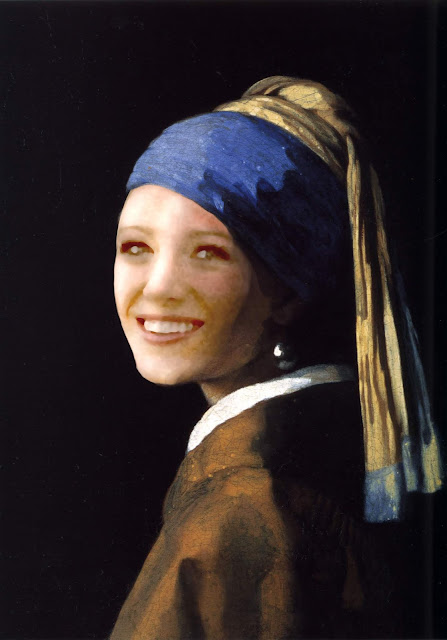
This project also uses Photoshop to put ourselves or someone else's face over the face of a famous painting or photo.  I chose the painting Girl with A Pearl Earring and I photoshopped Blake Lively's face on it.  This project was really hard, because the painting I chose had really weird lighting so it was hard to make the photoshopped image blend in.

Project 8: Somewhere

Image
Continuing to work in photoshop, we had to photoshop a ourselves or someone else into a location of our choosing.  I chose a photo of my friend and photoshopped her into a Parisian street at night.  This was challenging because the photo of her was taken midday and I was trying to put her on a darkly lit street.  I had to adjust the brightness and contrast a lot, and I also used the burn tool to add shadows.

Project 7: Autoscopy

Image
This was the first project we had using Photoshop.  The goal was to get used to the options available for editing photos.  I also really enjoyed this project, it was fun to be able to edit photos without trying to make them realistic.  To edit the photos, I adjusted settings like brightness, contrast, and saturation.  I also used photo filters to further change the photos.

Project 6: Poster

Image
This is the last project we did in Illustrator and we had to pick poster to recreate.  I chose a poster for a TV show called Wynonna Earp, which is based of a graphic novel.  For the majority of this project I used the pen tool and just built up multiple layers of base colors, highlights, and shadows.  I used the eye dropper tool to try and match the colors as closely as possible to the original illustration.  This was my favorite project so far, even though it took the most time to finish.

Project 5: Gradient Mesh

Image
Continuing to use Illustrator, our assignment was to pick a fruit or vegetable and create a realistic illustration.  I used the pen tool to outline the fruit and various highlights and shadows within the fruit.  I then used a combination of gradients, gradient mesh, blurring, and changing the opacity to achieve a realistic affect.  As a finishing touch, I added a vector texture in a light yellow to add slightly more realism.

Project 4: Business Cards

Image
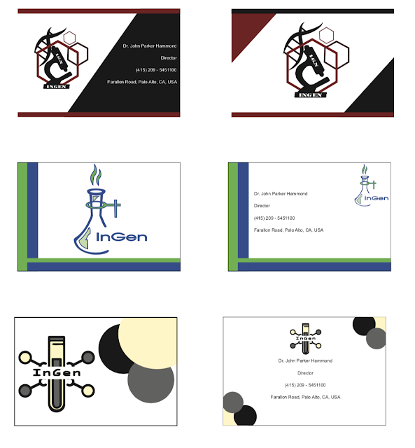
This was also done in Illustrator.  Taking inspiration from business card examples found online, I recreated 3 different business cards to match my logos.  I used mainly used the rectangle tool and the ellipse tool to create the background designs.  I like the top two cards a lot, but the black and red one is still my favorite.  The information on the card matches the information given about InGen in the book, Jurassic Park.

Project 3: Logo

Image
This project was done in Illustrator.  Using designs found online, I traced the logos with the pen tool and changed the colors.  The company I picked is the fictional science and research company from Jurassic Park.  I had originally liked the first logo I did, the top left, but by the end the last one was my favorite, bottom center.  I like the colors I chose to go with the design because it feels sinister, which matches the cooperation from the book.

Project 2: Calligram

Image
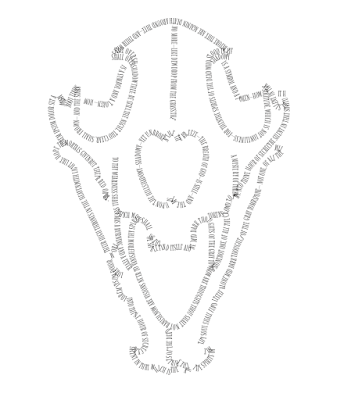
This project was made using Illustrator.  I picked a skull because they are always very interesting visually to draw.  First the image was traced using the pen tool and then the text was added by converting the lines to text using the type on a path tool.  I used a short story written by Edgar Allen Poe, to stay consistent with the darkish theme of this piece.

Project 1: Canvas

Image
This was made using the program Dreamweaver.  We had to code at least 10 different shapes to make a cohesive image.  The hardest part of this piece was matching up the dark green half circle on the tree with the lighter green circle beneath it.  I added gradients to both the sun an the sky to try and give a more dynamic feeling since it is a very static image.